Happy Saturday! Hope you have some time to play and be creative…
Today, I am keeping it simple and playing with the Theme from Less Is More (#470), the Colors suggested by the Global Design Project (#353) Team and the Tuesday Morning (#668) Sketch.


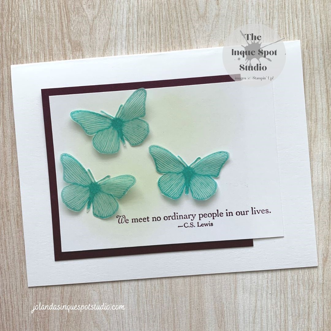
Here is the result:

Steps:
- Card Base: (8½” x 5½” scored at 4¼”) Basic White cardstock.
- Accent Panel: (3¾” x 3¼”) Blackberry Bliss cardstock.
- Focal Panel: (4¼” x 3”) Basic White cardstock.
- Using a Blending Brush, Soft Sea Foam ink was swirled into the upper left area of the panel.
- The sentiment, We meet no ordinary people in our lives., from the retired Summer Solstice stamp set was stamped with Blackberry Bliss ink along the bottom and to the right of the panel.
- Focal Image – Butterflies: (3½” x 3”) Vellum
- The Butterfly image from the same stamp set, was stamped into Versamark ink and then into Bermuda Bay ink three times, cleaning the stamp each time, and heat-set with Clear Embossing Powder.
- The backs of the Butterflies were colored with the Dark Soft Sea Foam Stampin’ Blend Marker.
- The Butterflies were then fussy cut with Paper Snips.
The card was assembled to match the sketch and the Butterflies were adhered with Mini Glue Dots.
Clean and simple! Quick and easy!
Thanks for spending some of your time with me today. Cheers, Jolanda.
Need a card? Ask me and I can create one for you. Want the supplies to create your own, let me know and I can help you with that too!
Like this card? Want to make one similar?
I would LOVE to be your Stampin’ Up! Demonstrator. If you live in the United States, you can order your paper crafting supplies from my on-line store. It is so easy. THANK YOU!
If you choose to shop with me today, please use HOSTESS CODE: C7E9W22R (July 2022) if you spend less than $150.00.
The new Holiday Catalog has arrived and Sale-a-bration is in full swing. Lots of lovely new things.

This is lovely. The sentiment is wonderful as well. Awesome job on all your challenges. Thanks for playing over at LIM.
LikeLiked by 1 person
This is just perfectly beautiful!! I love the pretty subtle colors and simple elegance of it! Thanks so much for creating with us this week at Tuesday Morning Sketches!
LikeLiked by 1 person
So pretty and such a lovely colour choice
Kathyk
LikeLiked by 1 person
Beautiful. I am a big fan of butterflies and yours are so pretty, I love the shading behind the butterflies.
LikeLiked by 1 person
Very pretty card. I love the small turquoise butterflies. Thanks for sharing at Less is More! Take care and keep crafting!
LikeLiked by 1 person
Beautiful card!!
Thanks for playing along this week at Tuesday Morning Sketches
Debbie – TMS DT
Debbie’s Dash of This and That
LikeLiked by 1 person
I would call this a BCAS card, Beautiful Clean And Simple. The color combo is striking and the soft color behind the butterflies is very subtle but effective. Wonderful to have you sharing your creation with everyone at Tuesday Morning Sketches. Debi DT TMS
LikeLiked by 1 person
Wow! Simply stunning CAS card. It packs a punch for sure. Thank you for joining us at Tuesday Morning Sketches.
LikeLiked by 1 person
This is so pretty and great quote! I love CS Lewis! Thanks for playing along with Tuesday Morning Sketches, hope to see you again!
LikeLiked by 1 person