
October 2nd, 2020 – Fall Florals
This week the my chosen theme for Simple Stamping is Fall Florals. I am not ready for Hallowe’en or Thanksgiving…but I am enjoying the colors of fall. Taking a trip to the Nursery, the explosion of colors in the different varieties of Fall Mums makes me happy!
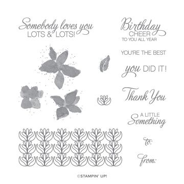
I wanted to use one stamp set and I chose “Petals & Parcels”. I love it and yet it has not seen as much ink as it should. Stampin’ Up!’s #SimpleStamping challenge for October is to use the sentiment “Thank You” and to add a ribbon. So today, all of these cards are Thank You Cards.
Easy

A super simple card is truly only one layer of paper, some ink and some stamps. I like to have a little definition when I create cards. Therefore, I have used a second layer. I also like using a second layer when adding a ribbon because the ribbon ends tuck nicely behind and it looks neat and tidy.
I created a collage of sorts by stamping the multiple images in the stamp set in different colors on a 4” x 5¼” piece of Very Vanilla cardstock in a random pattern. The colors I used were Bumble Bee, Pear Pizzazz, Cinnamon Cider and Terracotta Tile. Looking at it now as I am writing about it, I see that I created my own patterned paper. How cool would it be to create a full sheet and use it for making multiple cards or using it for a “one sheet wonder” cut pattern. Something to consider…
Step Up

To step up this card, I added another layer as a contrast mat and popped up the stamped panel for more dimension. I chose a two-color palette of Terracotta Tile and Cinnamon Cider to compliment the Very Vanilla neutral. Some tone-on-tone stamping on the card base adds an element of interest. The sentiment is custom punched with the Rectangle Postage Stamp punch and lightly sponged to create definition.
I used a combination of Calypso Coral dark and Cajun Craze light Stampin’ Blends to color the Whisper White Crinkled Seam Binding Ribbon to match the Terracotta Tile color. Turned out to be a great match!
Stepped Up

More layers!
Again, I created a collage of images. This time, I added a background color by mixing So Saffron ink with Glycerin and sponging on a Very Vanilla thick piece of cardstock. I chose the thick cardstock because it holds up nicely to manipulation and water.
The inked stamped images were stamped off and then spritzed with a water mist before I stamped on the paper. This gave me a softer slightly watercolor look.
An avid card maker generally has more tools because we want it all. So, I added elements from the coordinating Perfect Parcel Dies for the sentiment label and the accent strips in lieu of ribbon. I also chose to mat my stamped panel with Pear Pizzazz cardstock embossed with the decorative Parisian Flourish 3D embossing folder. A little bling…why not? I chose the Champagne Rhinestone Jewels. So pretty!
I am very happy with these cards. Do you like them? Do you have a favorite? Drop me a quick note to let me know which one and why.
Cheers, Jolanda
Thanks for spending a part of your day visiting with me. It is really appreciated.
Who can resist taking a stroll through Pinterest when you need a little inspiration to get you started? My tour led me to cards made by Ashley Fifer, Jaimie Babarczy and Tammy Wilson. Their creations became the springboard for mine. Thanks to each of you.
Post the card(s) you make using the theme “Fall Florals” on my Facebook Post: https://www.facebook.com/theinquespotstudio so we can all see your creativity.
Need a card? Ask me and I can create one for you.
Like these cards? Want to make them?
I would LOVE to be your Stampin’ Up! Demonstrator. If you live in the United States you can order your paper crafting supplies from my on-line store. It is so easy. THANK YOU!
If you choose to shop with me and you spend less than $150.00, please use: HOSTESS CODE: 37N7RXTT
Principle Product Supply List:


Those cards are just beautiful!! Amazing to see how pretty a simple stamping card can be!! Love the way you stepped it up!
LikeLike