Those deadlines just keep coming…welcome back!
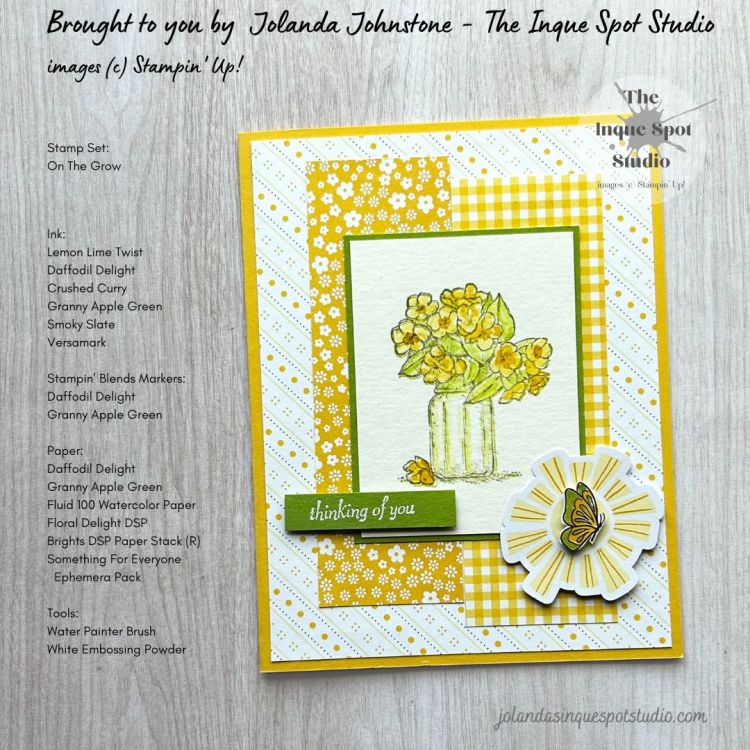
Facebook’s Stampin’ Through The Catalog (a share only Stampin’ Up! inspiration site) featured Lara Moss @scrappykea as their Guest Designer this week, and we are invited to CASE (copy and selectively edit) her project. I rarely do any scrapbooking, so I translated her inspiration into a card.
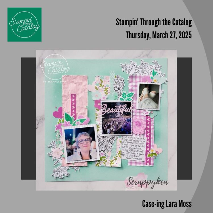
My takeaways: Patterned Papers including Florals and Gingham; Ephemera; Framed Image; two principal Colors; and a vertical orientation.
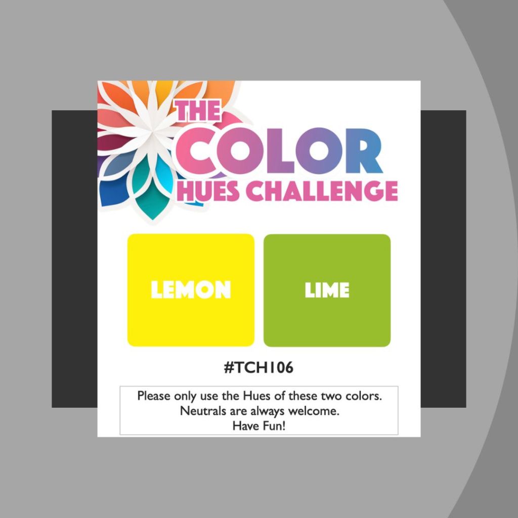
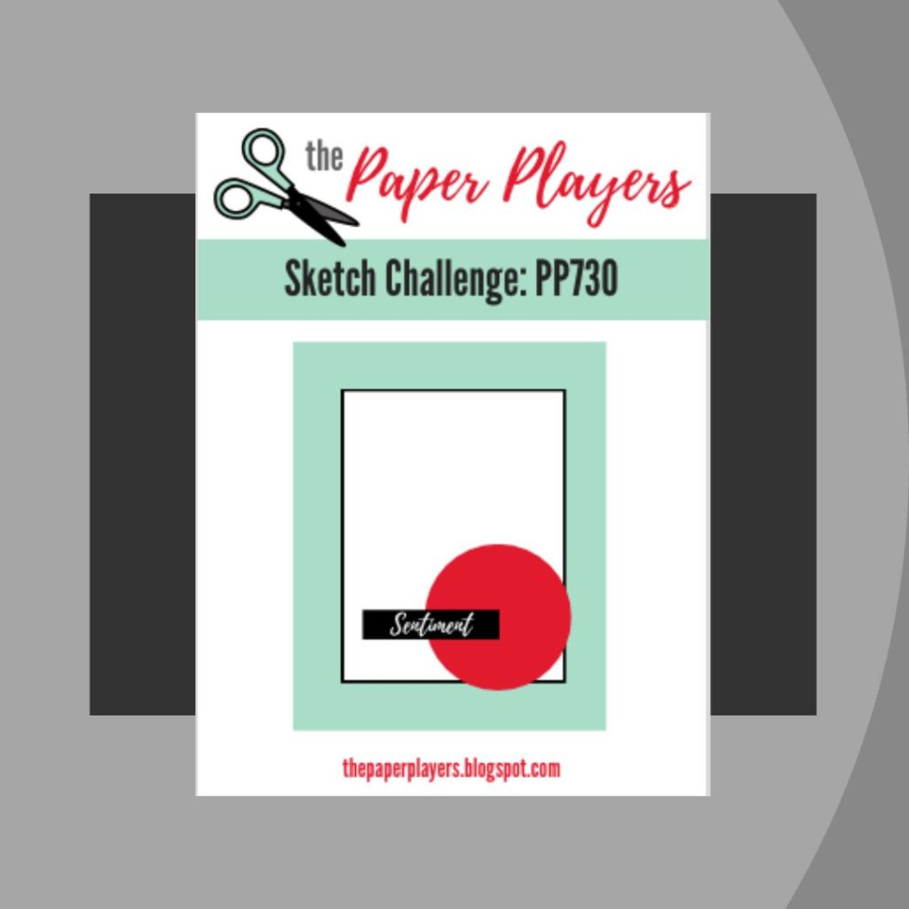
My design was influenced by: Color Hues (#106) featuring Lemon and Lime and Ann’s Paper Players (#730) Sketch.
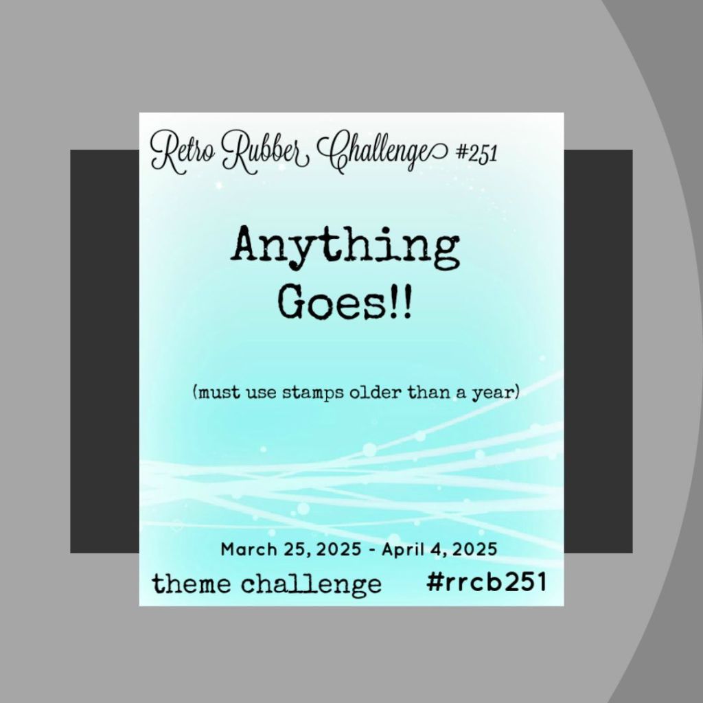
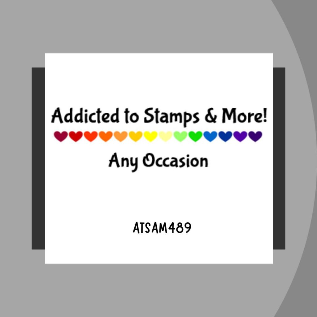
For Retro Rubber (#251), I selected the retired stamp set On The Grow (circa 2011) for their Anything Goes theme and am sharing with Addicted To Stamps & More (#489) for their Any Occasion theme.
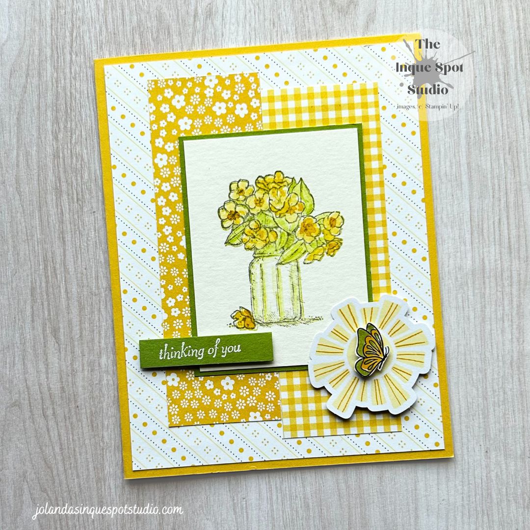
Here is the result:
Steps:
- Card Base: (8½” x 5½” scored at 4¼”) Daffodil Delight cardstock.
- Background Panel: (5¼” x 4”) Daffodil Delight and Basic White Diagonal patterned piece of paper from the Floral Delight Designer Series Paper pack.
- Block: (1½” x 4½”) Daffodil Delight Gingham patterned piece of paper, also from the Floral Designs Designer Series Paper pack, and Daffodil Delight Floral patterned piece of paper from the retired Brights Designer Series Paper Stack (still in my stash).
- Accent Mat (Frame): (2⅜: x 3⅛”) Granny Apple Green cardstock.
- Focal Panel: (2¼” x 3″) Fluid 100 Watercolor Paper.
- The Flowers in Jar image was stamped with Lemon Lime Twist ink.
- Using the Fine-Tipped Water Painter Brush, the Leaves and the Jar were blurred by pulling in the ink. Accents were added with Granny Apple Green ink.
- The Flowers were painted with Daffodil Delight ink and accents were added with Crushed Curry ink.
- Once dry, the image was over-stamped with Smoky Slate ink to get the fine detail lines.
- Shape – Sunburst and Butterfly: The pieces were selected from the Something For Everyone Ephemera Pack. The Butterfly was colored with both the Dark Daffodil Delight and Granny Apple Green Stampin’ Write Markers.
- Sentiment Label: (1¾” x ⅜”) Granny Apple Green cardstock scrap.
- The sentiment, thinking of you, was stamped with Versamark ink and heat-set with White Embossing Powder.
All elements were adhered to the card base to resemble the sketch. The Ephemera Elements and the Sentiment were popped up with Dimensionals.
This image from the On The Grow stamp set is one of my favorites and it looks delightful in the spring yellow and green coloring.
I hope you see how I was inspired by Lara’s beautiful scrapbook page.
Thanks for spending a little bit more of your time with me today. Cheers, Jolanda!
Need a card? Ask me and I can create one for you. Want the supplies to create your own, let me know and I can help you with that too!
Like this card? Want to make one similar?
I would LOVE to be your Stampin’ Up! Demonstrator. If you live in the United States, you can order your paper crafting supplies from my on-line store. It is so easy. THANK YOU!
If you choose to shop with me today, please use HOSTESS CODE: BWNMWNPK (March 2025) if you spend less than $150.00. The Mini Catalog and the On-Line Store both have lots of great products. There are some wonderful choices.

I love your take on the sketch, Jolanda! What a wonderful mix of patterns! The sunburst and butterfly are great little eye catchers! Thank you for playing in my sketch challenge at The Paper Players this week!
LikeLiked by 1 person
I like your watercoloured focal point – really pretty. You’ve mixed the patterns of the papers so well. Thanks for sharing with us at The Paper Players. 🙂
LikeLiked by 1 person
It most definitely mimics a scrapbook page design. Very pretty use of the papers and the sketch. Thanks so much for using our colors here at Color Hues Jolanda!
LikeLiked by 1 person
Wow, what a great study in yellows – love those patterns together, Jolanda! I also love that image – an oldie and goodie, for sure! Thanks so much for playing at Retro Rubber!
LikeLiked by 1 person
So pretty! Love the florals and use of pattern paper! Thank you so much for playing along with us over at Color Hues! – Sheri
LikeLiked by 1 person
That’s so pretty! Love the way you’ve taken elements from the scrapbook page
LikeLiked by 1 person
Your sense of balance and design is always spot on, Jolanda. Such a pretty card using our colors of Lemon and Lime. Always nice to have you in our gallery at Color Hues, thanks for playing.
LikeLiked by 1 person
So pretty, Jolanda. I love the yellow and creams together and how you mixed the DSPs together. All of these elements created a beautiful, bright, sunny card guaranteed to brighten anyone’s day. So glad you joined us at the Paper Players this week
Jaydee
LikeLiked by 1 person
Thank you, Jayden!
LikeLike
Lovely card! I like the way you have used the sketch. Thanks for sharing with ATSM!
LikeLiked by 1 person