Hi again! One more card for today…don’t you love Sundays…
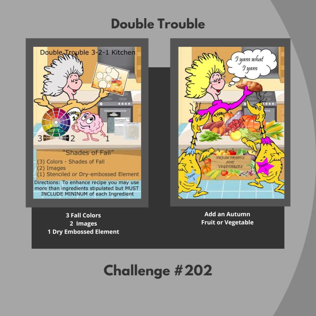
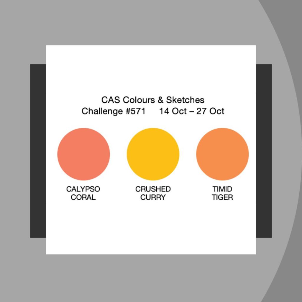
This time around I am playing with: Double Trouble (#202) 3-2-1 Recipe with Twist; CAS Colours & Sketches (#571) for the Palette; and the Freshly Made (#709) Sketch for a clean and simple card.

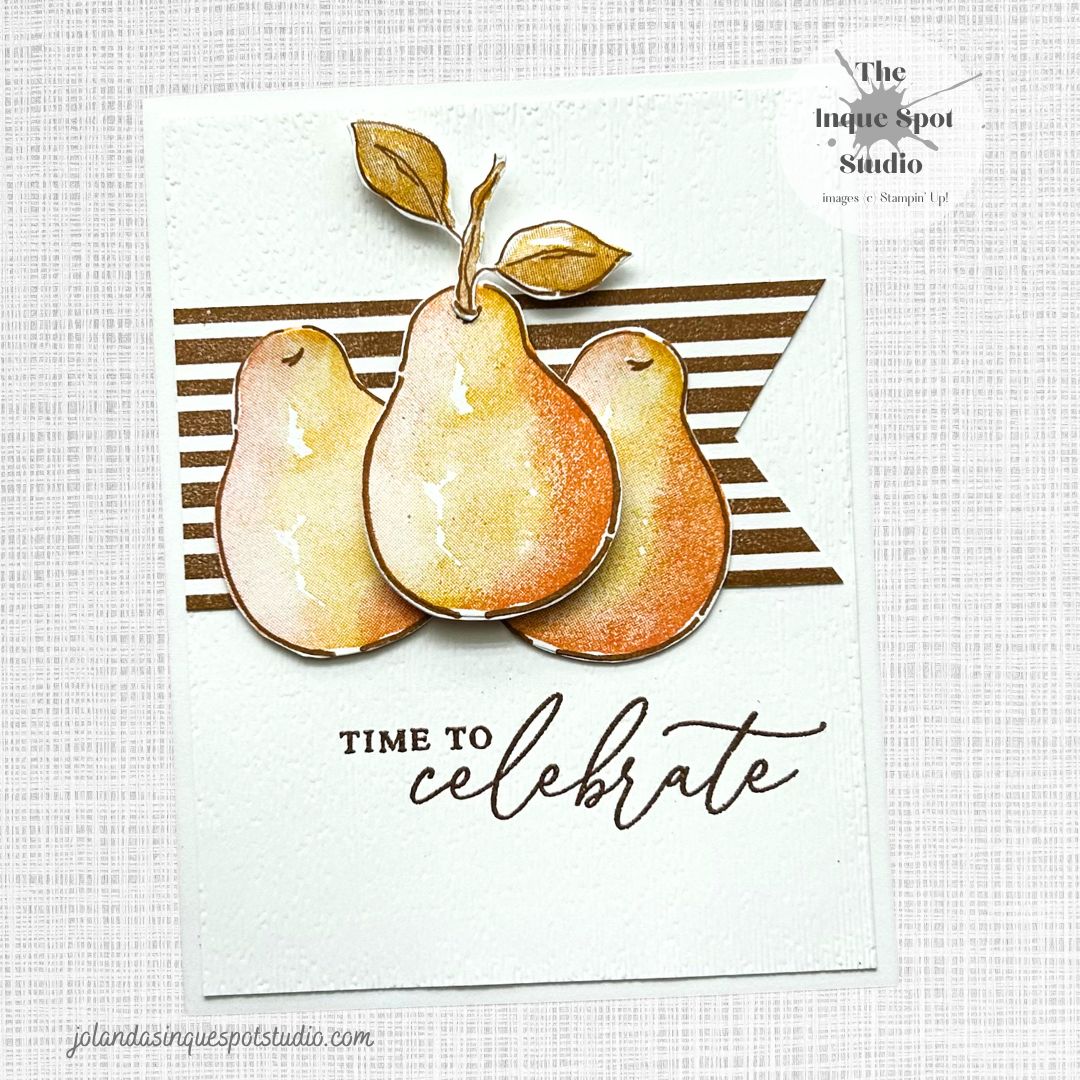
Here is the result:
Steps:
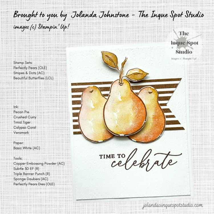
- Card Base: (8½” x 5½” scored at 4¼”) Basic White cardstock.
- Background Panel: (4” x 5¼”) Basic White cardstock.
- The greeting, Time to celebrate, from the Beautiful Butterflies stamp set, still available but now on the Last Chance List, was stamped with Versamark ink and heat-set with Copper Embossing Powder.
- The panel was then dry-embossed with the retired Subtle 3D Embossing Folder.
- Banner: (4¼” x 2”) Basic White cardstock.
- The Stripes image from the Stripes & Dots stamp set was stamped with Pecan Pie ink and then trimmed to (4” x 1¾”) and flagged with the retired Triple Banner Punch.
- Focal Image – Pears: (5½” x 4¼”) Basic White cardstock.
- The Large Pear Outline image from the Perfectly Pears stamp set, an On-Line Exclusive Product, was stamped three times with Pecan Pie ink.
- The Large Pear In-Fill image was inked with Crushed Curry ink and using Sponge Daubers, Calypso Coral and Timid Tiger inks were added to the image for subtle coloring before stamping.
- The Leafed Stem Outline image, from the same stamp set, was also stamped with Pecan Pie ink.
- The Leafed Stem In-Fill image was added with 2nd Generation Pecan Pie ink (stamped off once), and the Leaf only was restamped over top with Crushed Curry ink.
- Both the Pears and the Leaf Stem were die-cut with the coordinating dies from the Perfectly Pears Dies set.
All elements were adhered to the card base to resemble the sketch with the center Pear popped up with Dimensionals.
Time to celebrate the Fall with sweet succulent Pears.
Thanks for spending some more of your time with me today. Cheers, Jolanda!
Need a card? Ask me and I can create one for you. Want the supplies to create your own, let me know and I can help you with that too!
Like this card? Want to make one similar?
I would LOVE to be your Stampin’ Up! Demonstrator. If you live in the United States, you can order your paper crafting supplies from my on-line store. It is so easy. THANK YOU!
If you choose to shop with me today, please remember that every purchase of $20.00 or more will yield 10% in Rewards that can be used on your next purchase. The new Mini Catalog is here, and new products have been added to the On-Line Store. Lots of great choices. Check out the Last Chance List for retiring products and deals.

Jolanda! I adore your beautiful pears! So beautifully inked! What a gorgeous card!
Thanks so much for playing at FMS this week!
=] Michele
LikeLiked by 1 person
This is just lovely! This inking is beautiful ~ a perfect fall card. Thanks for joining our Double Trouble Challenge.
LikeLiked by 1 person
this is a fab representation of the sketch! @chevron2
LikeLiked by 1 person
Love the subtle way you used our colors for the pears; it’s a beautiful autumn-ish card without using traditional fall images! Thanks for sharing at CAS Colours & Sketches!
LikeLiked by 1 person
Such a beautiful card. Its a perfect example of how you can combine and alter the colors to get a whole different look. Well done! Thanks for sharing your card with us at CAS Colours and Sketches.
LikeLiked by 1 person
Very pretty – love the CAS design. Thanks for sharing with us at Double Trouble :’
LikeLiked by 1 person
The pears you’ve created are absolutely gorgeous! They are so wonderfully classic with the stripes and the texture behind them. Thank you for playing along with us at Freshly Made Sketches.
LikeLiked by 1 person
These pears bring back memories of childhood… remembering the very green pears and waiting anxiously for them to ripen and turn color… these are perfect color of ripeness. Nice subtle embossing, texture and great coloring. Beautiful card and thanks for sharing your delicious recipe with us at Double Trouble.
LikeLiked by 1 person
So beautiful! Love those pears. Glad you joined us this week at FMS!
LikeLiked by 1 person
Beautiful card, Joland! These pears are absolutely fabulous! Thanks for joining us at FMS this week.
LikeLiked by 1 person
The pears look amazing! Great fall card, thank you for joining us at the Double Trouble challenge.
LikeLiked by 1 person
The warmth and richness of your pear trio is absolutely captivating. I love how the subtle daubing of Calypso Coral and Timid Tiger brings a gentle glow to the Crushed Curry base—such a thoughtful touch that elevates the autumn palette. The copper-embossed sentiment adds a celebratory shimmer, and the striped banner grounds everything with cozy charm. This layout is beautifully balanced, and the center pear popped with dimensionals draws the eye just right. A truly elegant nod to fall.
LikeLiked by 1 person