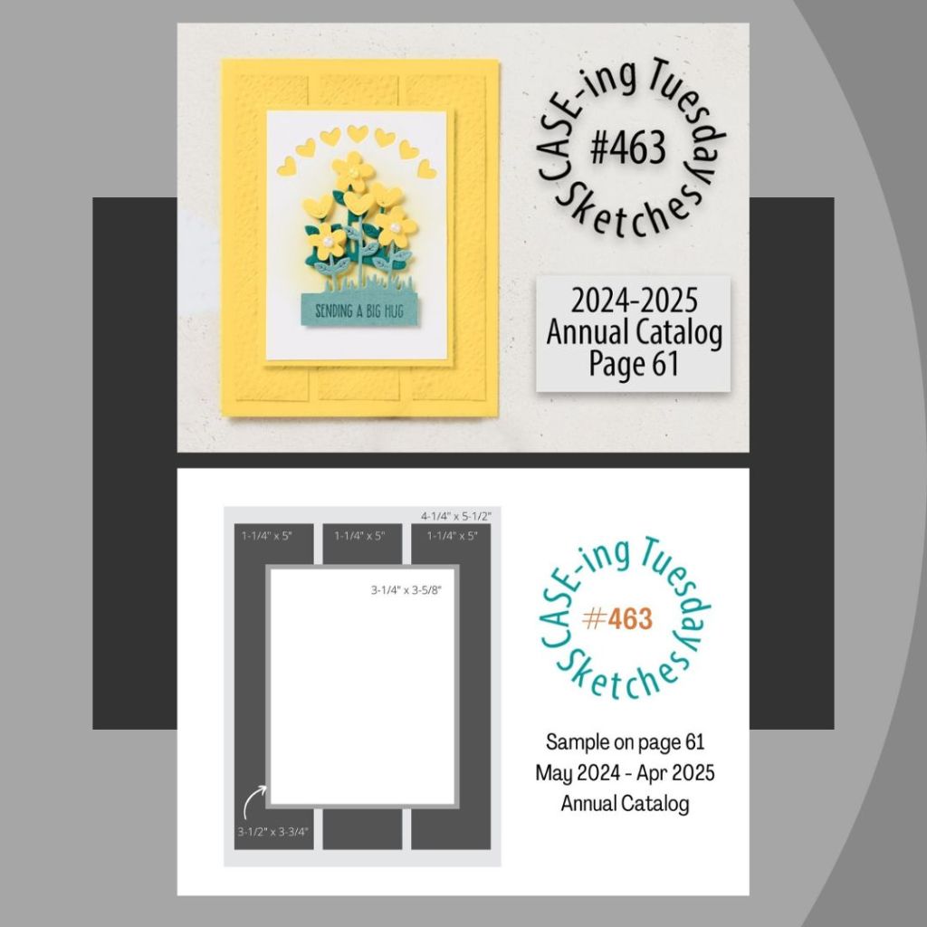
Catching up with the Design Team for Facebook Case-ing Tuesday (#463). The card we are case-ing can be found on page 61 of the Annual Catalog.
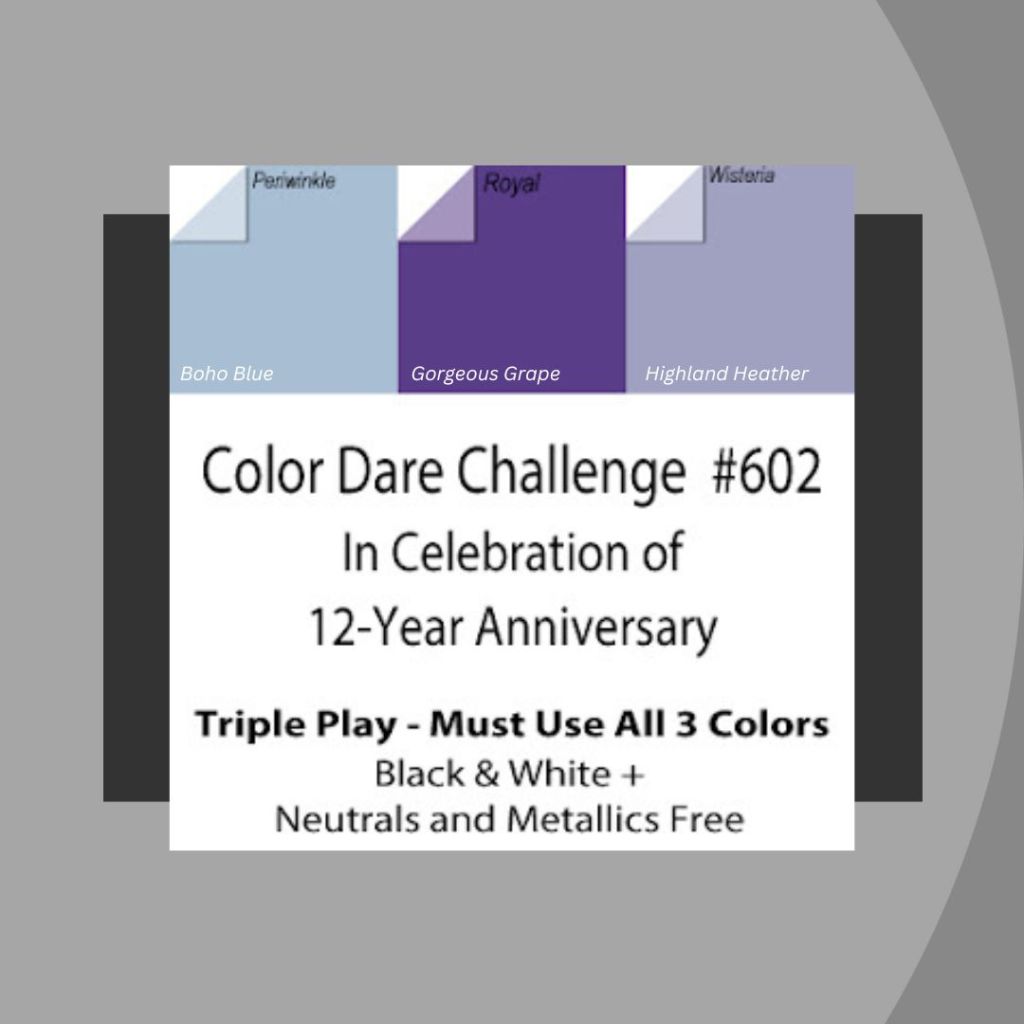
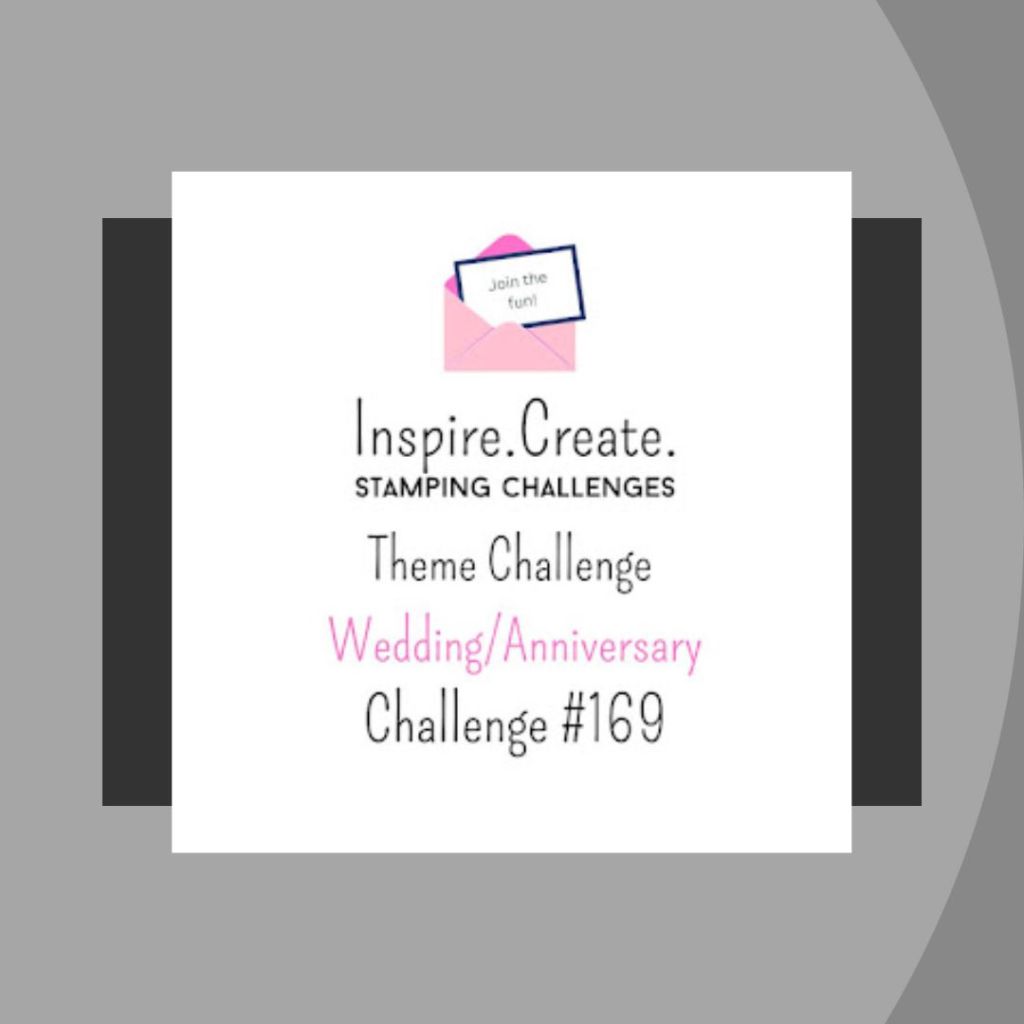
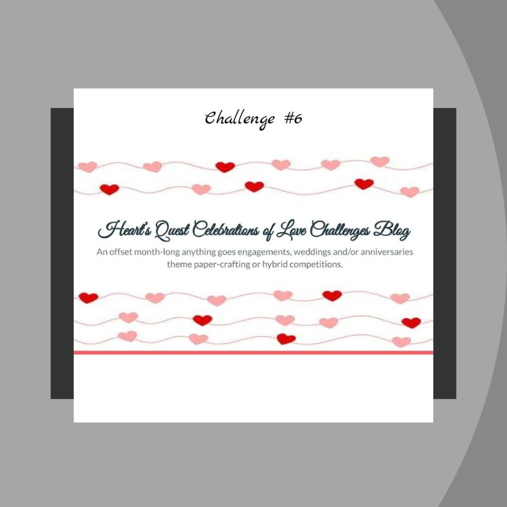
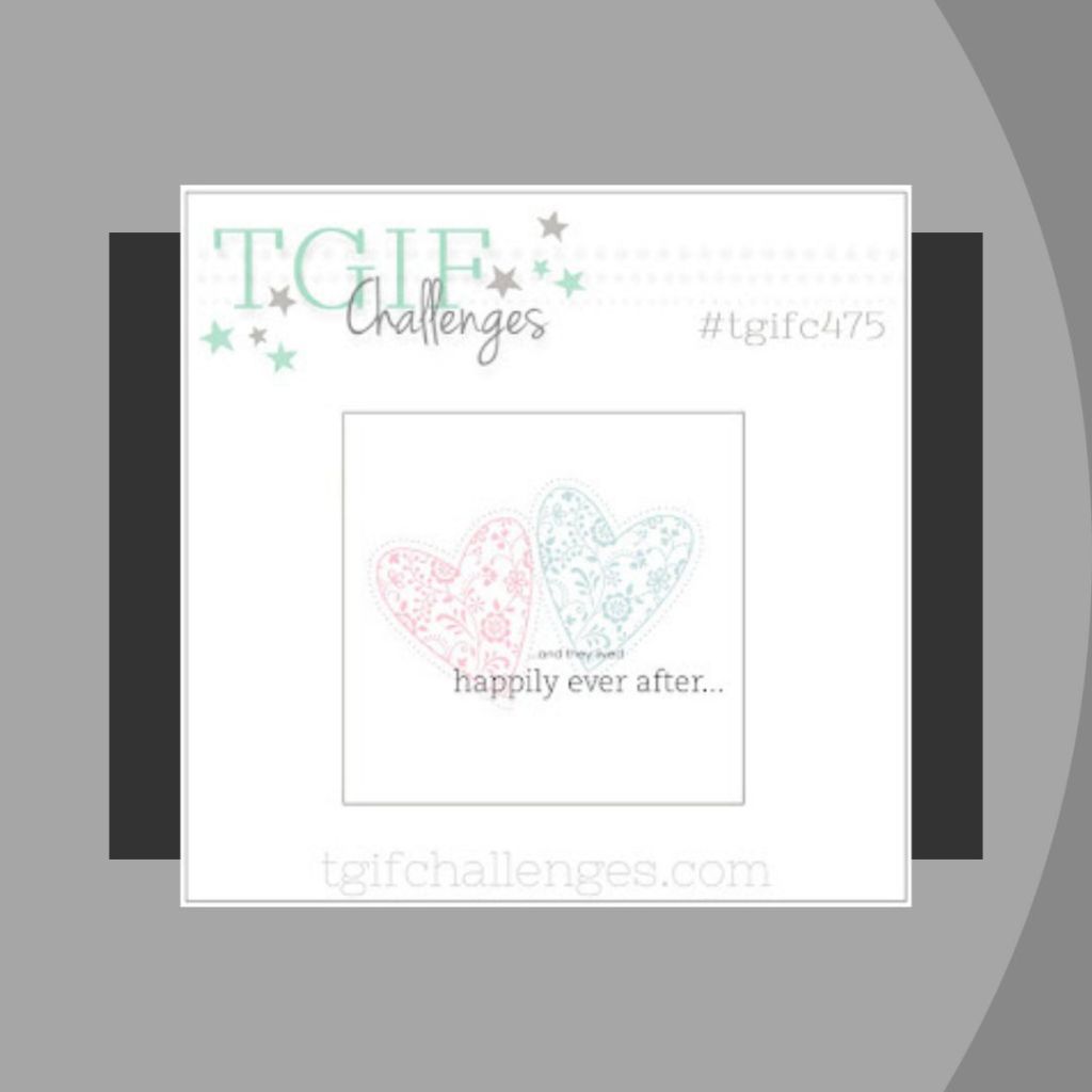
I wanted to use the Color Dare (#602) palette to create a Wedding card for a few challenges that currently have that as a theme: Inspire Create (#169), Heart’s Quest Celebrations of Love (#6) and TGIF (#475).
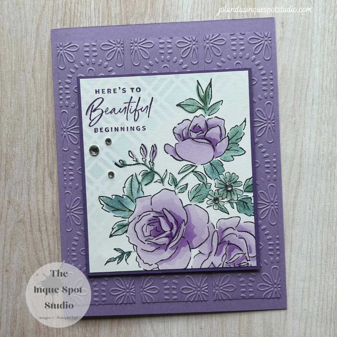
Here is the result:

Steps:
- Card Base: (8½” x 5½” scored at 4¼”) Highland Heather cardstock.
- Triple Strips: (1¼” x 5”) Highland Heather cardstock dry-embossed with the Floral Fun Patterns Embossing Folder, an On-Line Exclusive Product.
- Accent Mat: (3¼” x 3¾”) Gorgeous Grape cardstock.
- Focal Panel: (3⅛” x 3⅝”) Basic White cardstock.
- A portion of the large Floral image from the Layers of Beauty stamp set was stamped with Memento Tuxedo Black ink.
- Using the coordinating Layers of Beauty Decorative Masks, Blending Brushes and/or Sponge Daubers, the colors were added. Stencil #1 – Highland Heather and Boho Blue; Stencil #2 – Highland Heather and Boho Blue; Stencil #3 – Gorgeous Grape; Stencil #4 – Boho Blue; and Stencil #5 – Boho Blue.
- The truncated sentiment, Here’s to Beautiful Beginnings, from the Something Fancy stamp set was stamped with Gorgeous Grape ink.
- Using the Trellis Stencil from the retired Foursquare Decorative Masks set, a very light application of Boho Blue ink was added with a Blending Brush.
All elements were adhered to the card base to resemble the sketch. The Matted Focal Panel was popped up with Dimensionals and a few Rhinestone Basic Jewels were added for a bit bling.
A lovely wedding card.
Hope you can find some time to join us at Case-ing Tuesday this week. I would love to see what you will create for this sketch.
Thanks for spending some more of your time with me today. Cheers, Jolanda!
Need a card? Ask me and I can create one for you. Want the supplies to create your own, let me know and I can help you with that too!
Like this card? Want to make one similar?
I would LOVE to be your Stampin’ Up! Demonstrator. If you live in the United States, you can order your paper crafting supplies from my on-line store. It is so easy. THANK YOU!
If you choose to shop with me today, please use HOSTESS CODE: AY3MGJJK (June 2024) if you spend less than $150.00. Take a look at the new Catalog. Visit the On-Line Store to see the new Exclusive Products available. There are some really wonderful choices.

beautiful (fab)
LikeLiked by 1 person
Gorgeous card. Love the embossed strips and that lovely Layers of Beautify stamp set. Your colors are beautiful. TFS
LikeLiked by 1 person
Love this card! It’s so beautiful!
LikeLiked by 1 person
Stunning! Thank you for celebrating with us at Color Dare.
LikeLiked by 1 person
The embossed BG really lends a lot of interest to your beautiful card. Thank you for sharing with us at Color Dare.
LikeLiked by 1 person
Beautiful! You’ve really made our colors shine! Thank you for sharing at Color Dare. We love seeing your artwork!
LikeLiked by 1 person
I just realized you used green for your leaves. Green is not one of the colors for our challenge at Color Dare. So sorry.
LikeLiked by 1 person
Hi!
I did not use Green. The color I chose is Boho Blue. This color has been matched to Periwinkle by CTMH and SU! and was applied with a clean Sponge Dauber. It just comes out looking a little bit green against the more purple colors of Highland Heather and Gorgeous Grape.
Thanks for your comment. Cheers!
LikeLike
So sorry. Sometimes the lightning can make colors look different.
LikeLiked by 1 person
So true!
LikeLike
Gorgeous wedding card!!! Purple’s my favorite color so you had me hooked just by the main color! And the sentiment is terrific! That’s a wonderful choice for a wedding card! I might just use that in the next month or so! 🙂 Thanks for creating and sharing this pretty wedding card with HQCOLCB! –Becca
LikeLiked by 1 person
Beautiful card! I love the purple. Thanks for sharing it with us at Inspire.Create.Challenges.
LikeLiked by 1 person